myPlanMember: A Complete Platform for Members and Admins

In today’s fast-paced world, members are looking for more than just financial tools—they want guidance, convenience, and support through every stage of life. That’s where myPlanMember comes in. Designed as a one-stop digital platform, myPlanMember empowers users to take control of their financial future while supporting their lifestyle and family goals along the way.
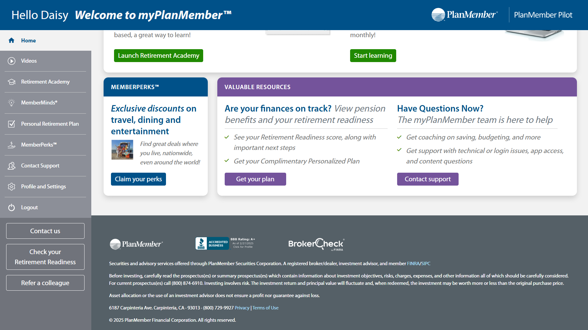
From a growing library of engaging video content and informative articles tailored to different life stages, to MemberPerks offering exclusive discounts on entertainment, dining, and travel—myPlanMember offers value that goes well beyond traditional planning tools. At its core, the platform features a robust Personal Retirement Plan (PRP) tool and our Retirement Academy, where users can deepen their understanding of retirement planning through accessible, educational content.
With new resources added regularly, myPlanMember is more than a resource—it’s a personalized support system for members navigating life, money, and retirement with confidence.
Introduction
Objective
The objective of this case study is to explore how myPlanMember delivers a holistic, user-centered experience that supports members in achieving their financial, lifestyle, and retirement goals. By offering a diverse mix of educational content, planning tools, and exclusive member benefits, the platform aims to enhance member engagement, simplify complex planning decisions, and provide ongoing value through every life stage.
🧠 Key User Insights: What Members Want from myPlanMember
To better understand the needs of our users, mainly educators and nonprofit professionals, we conducted focus groups and polls with 15 participants representing over 15 school districts and education service agencies across multiple states. Participants included superintendents, HR administrators, benefits coordinators, and district leaders—many of whom manage multiple districts or hold dual roles (e.g., full-time and adjunct faculty).
These sessions provided us with rich qualitative data on member expectations, communication preferences, and content needs—shaping the foundation for the updated myPlanMember platform. The following key insights summarize what our users want most from a platform like myPlanMember—and served as the guiding principles for our design and content decisions.
1. Clear, Engaging, and Easy-to-Digest Content
“No one wants to read.”
Users expressed a strong preference for video content over lengthy articles. Content needs to be visually engaging, short-form, and accessible across devices. They want to consume information quickly—especially when it comes to complex topics like retirement.
2. Access to Personalized Retirement Guidance
“Our members need to be planning outside of the public system.”
There is high demand for reliable, personalized retirement support, especially as members navigate uncertain retirement systems. Members want tools that reflect their unique situation, and they appreciate guidance they can trust and access on their own terms.
3. One-on-One Human Support
“Would the coach be a chatbot or phone contact?”
Users value the option to talk to a real person, especially for sensitive topics like finances. There was a clear desire for live coaching support, either through appointments or on-demand resources.
4. Broad but Relevant Lifestyle Content
“I also thought there was family wellness and general wellness… that’s valuable.”
Members want more than financial guidance. They’re interested in content that supports their whole life—from family and wellness to planning for future milestones.
5. Flexible, Non-Intrusive Communication
“They don’t read emails. Texts work better.”
Communication methods vary by generation. While email is still commonly used, members also want non-intrusive reminders, intranet updates, or in-person mentions during staff events. They don’t want to feel overwhelmed or spammed.
6. A Platform That Supports Early and Late Career Stages
“This favors mid to late career… but we need something for onboarding too.”
Members appreciate support throughout their career, especially at onboarding and retirement planning milestones. There’s a need for early education and simple tools to help younger staff engage early on.
7. Trust, Security, and Simplicity
“Data security is a concern.”
Members want tools that are secure, intuitive, and easy to navigate. Many had frustrations with previous platforms that were clunky or lacked transparency.
Our Response: What We Decided to Prioritize
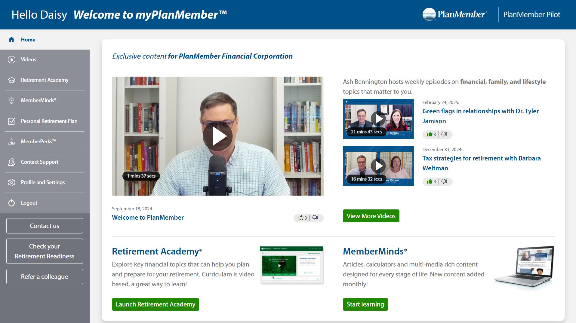
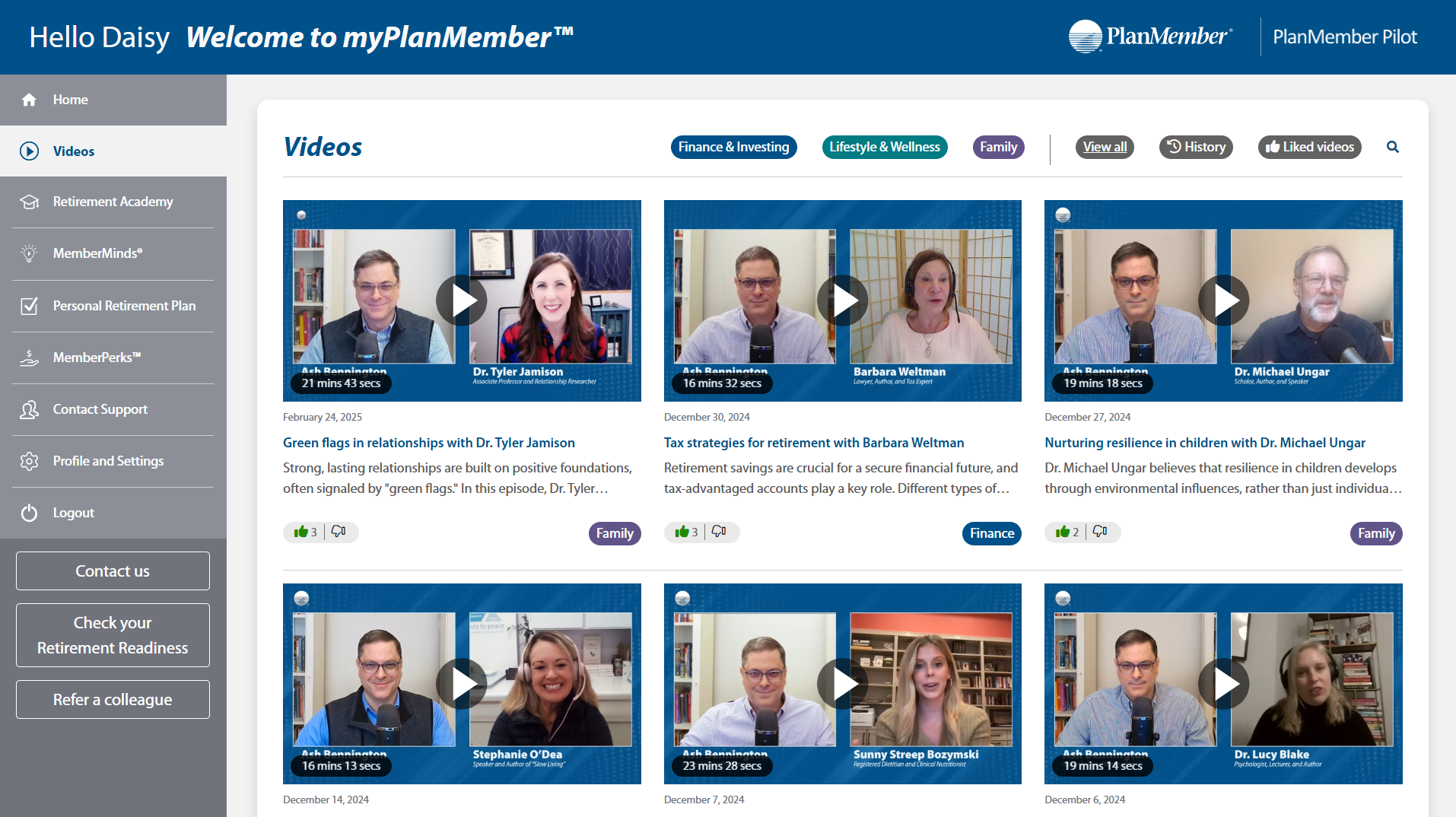
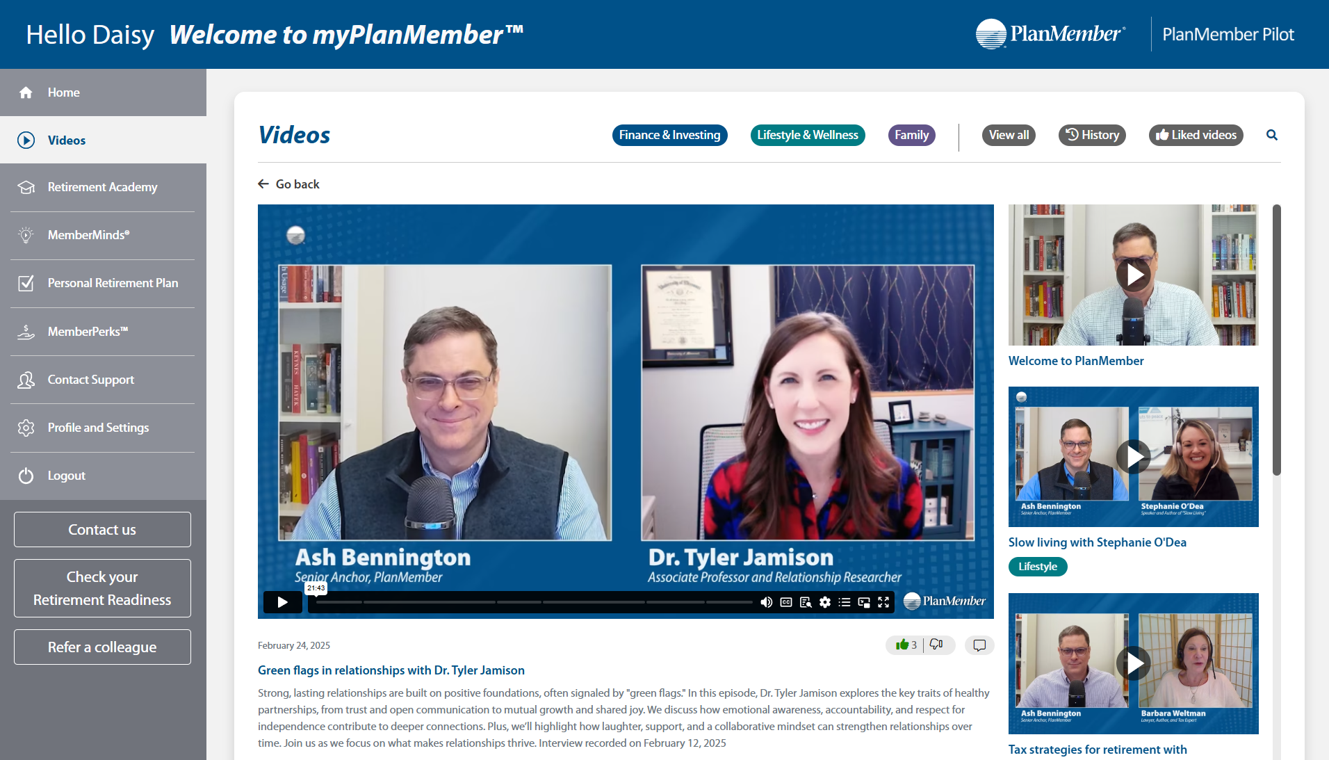
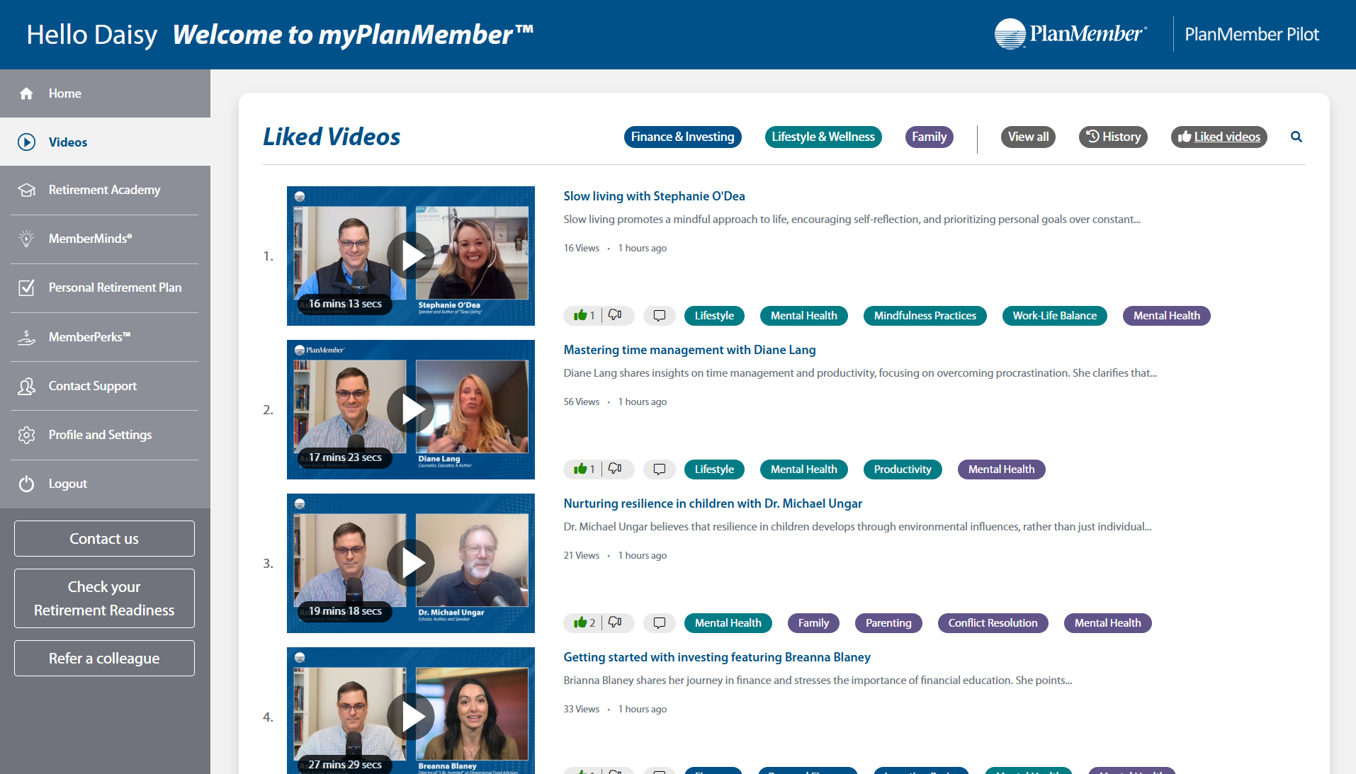
1. Video-First Content Experience
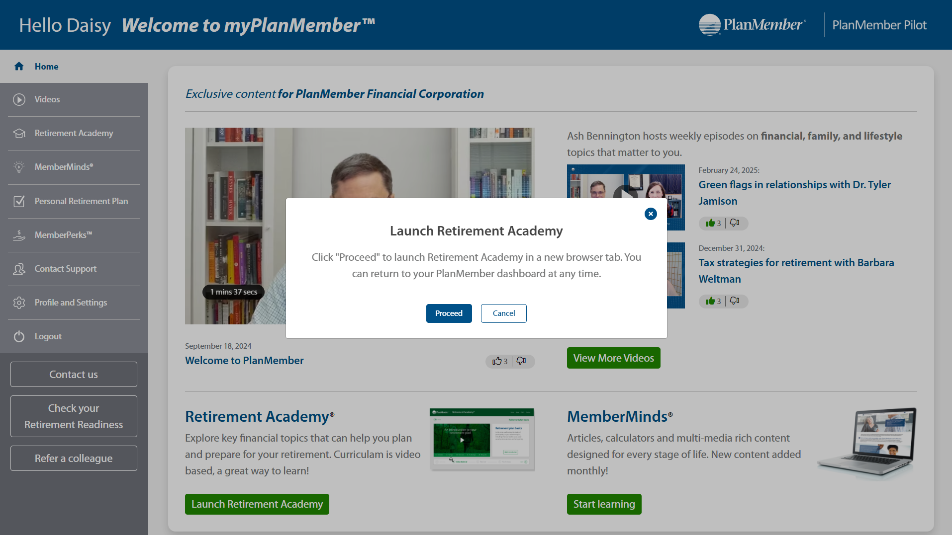
To meet user preferences for engaging, visual learning, we made video content the centerpiece of the platform. Videos are short, easy to navigate, and cover a range of financial, lifestyle, and wellness topics—with regular updates and diverse guest speakers.
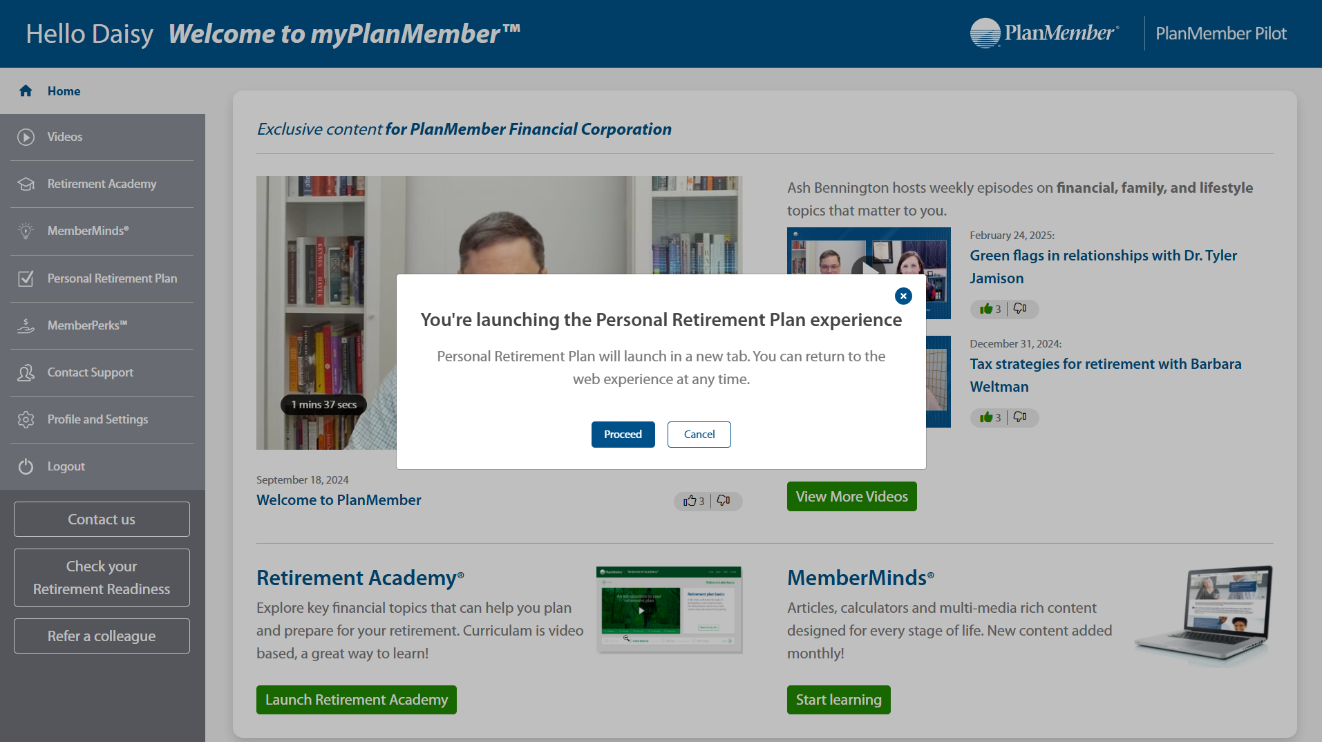
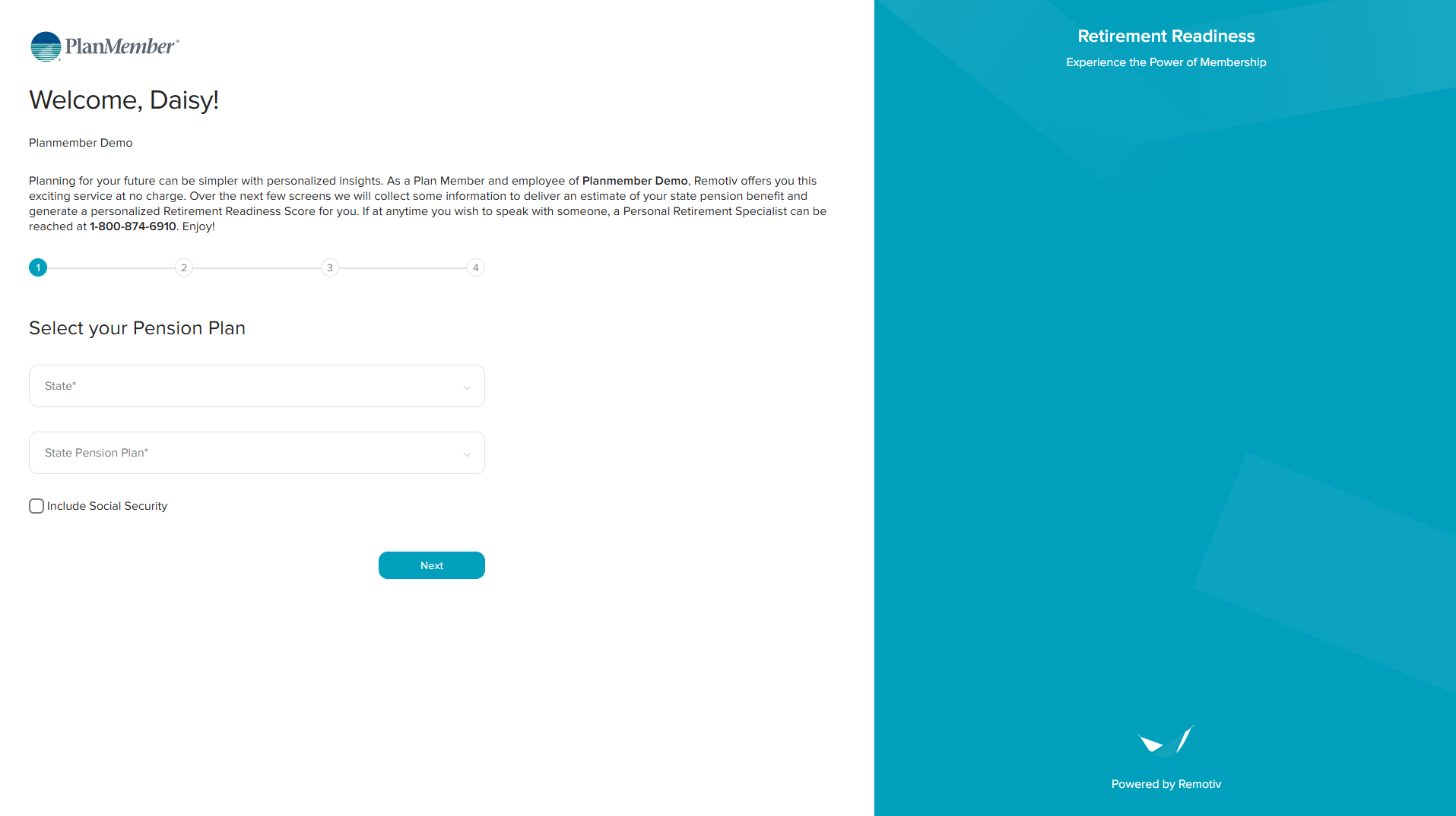
2. Robust Retirement Tools
We expanded the Personal Retirement Plan (PRP) and introduced the Retirement Academy—equipping users with clear, personalized resources to better understand their retirement outlook and options within public systems.
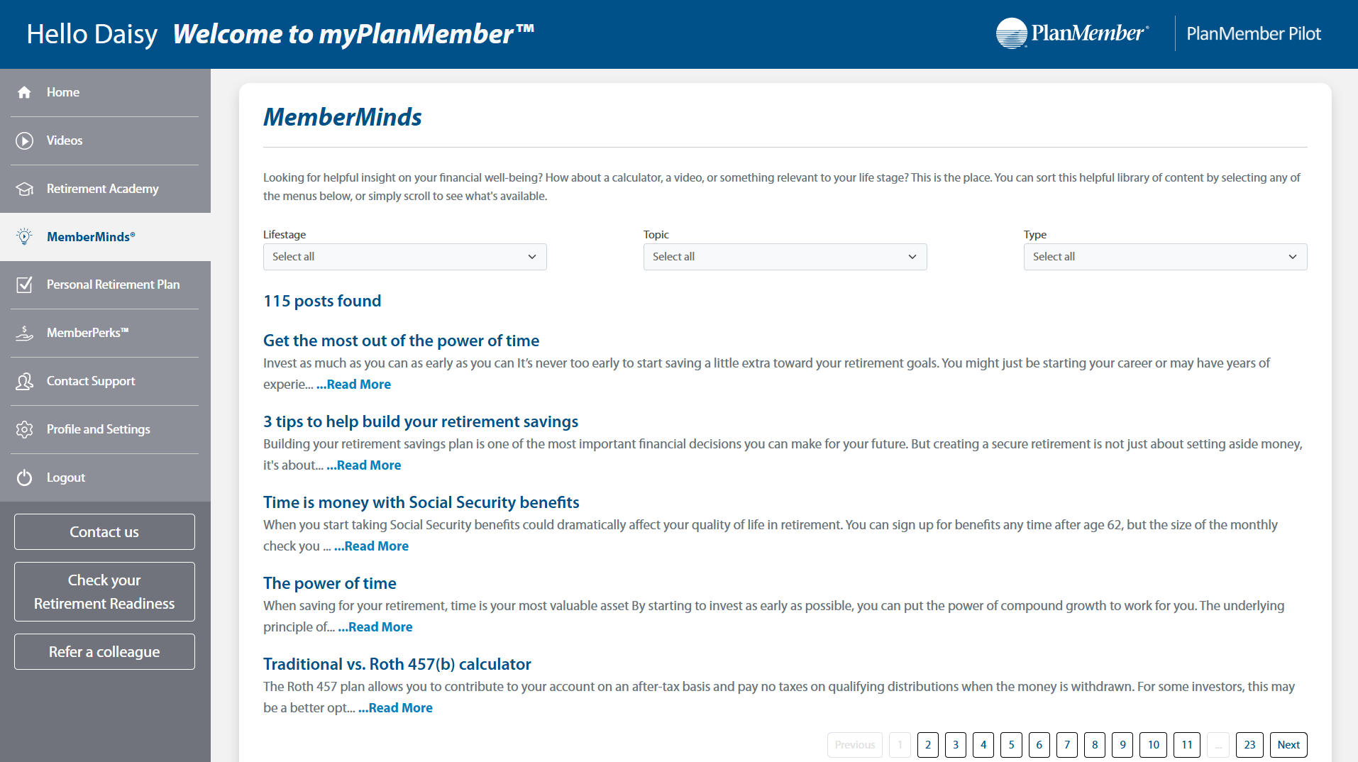
3. Broad Lifestyle & Wellness Content
In addition to financial guidance, we prioritized content that supports members’ full lives—including topics on family wellness, personal growth, and navigating life transitions.
4. Content for All Career Stages
Our platform now includes content tailored to different points in a member’s career journey—from onboarding and early financial education to mid- and late-career retirement planning.
5. Simple, Secure Desktop Experience with Mobile App Support
The platform was designed with an intuitive desktop experience in mind, while a dedicated mobile app ensures accessibility for members who prefer to engage with content on the go.
With these priorities in place, we translated our strategy into a user-centered design that brings the myPlanMember experience to life—tailored, intuitive, and built around what our members value most.
🎨 Visual Design System
To support a calm, trustworthy, and engaging member experience, I developed a clean visual language using a vibrant, brand-aligned color palette. These colors were chosen to promote clarity, support accessibility, and create strong visual hierarchy throughout the myPlanMember platform.
Primary Colors
#005189– Deep navy blue for primary buttons, navigation, and headings#0082BF– Secondary blue for accents and hover states#A3D9F5– Light blue used for backgrounds and soft highlights#017C84– Teal accent for visual balance
Accent Colors
#208900– Bright green for primary call-to-action buttons (e.g., "Start learning")#5CB85C– Soft green for positive feedback states and confirmation moments#74539B– Rich purple used for category tagging and feature highlights
Grays & Neutrals
#454545,#707070,#767777,#68737A– A flexible range of dark-to-medium grays used for text, borders, icons, and UI elements
Typeface
Myriad Pro – Chosen for its clarity, professionalism, and legibility across long-form content and UI labels.
Explore key screens below from the redesigned myPlanMember platform, each thoughtfully crafted to align with user needs.
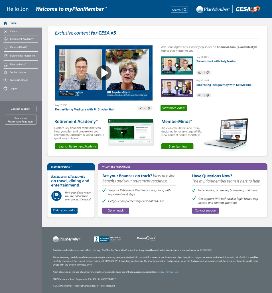
Inside the myPlanMember Experience
🪄 Designing the Admin Side of myPlanMember
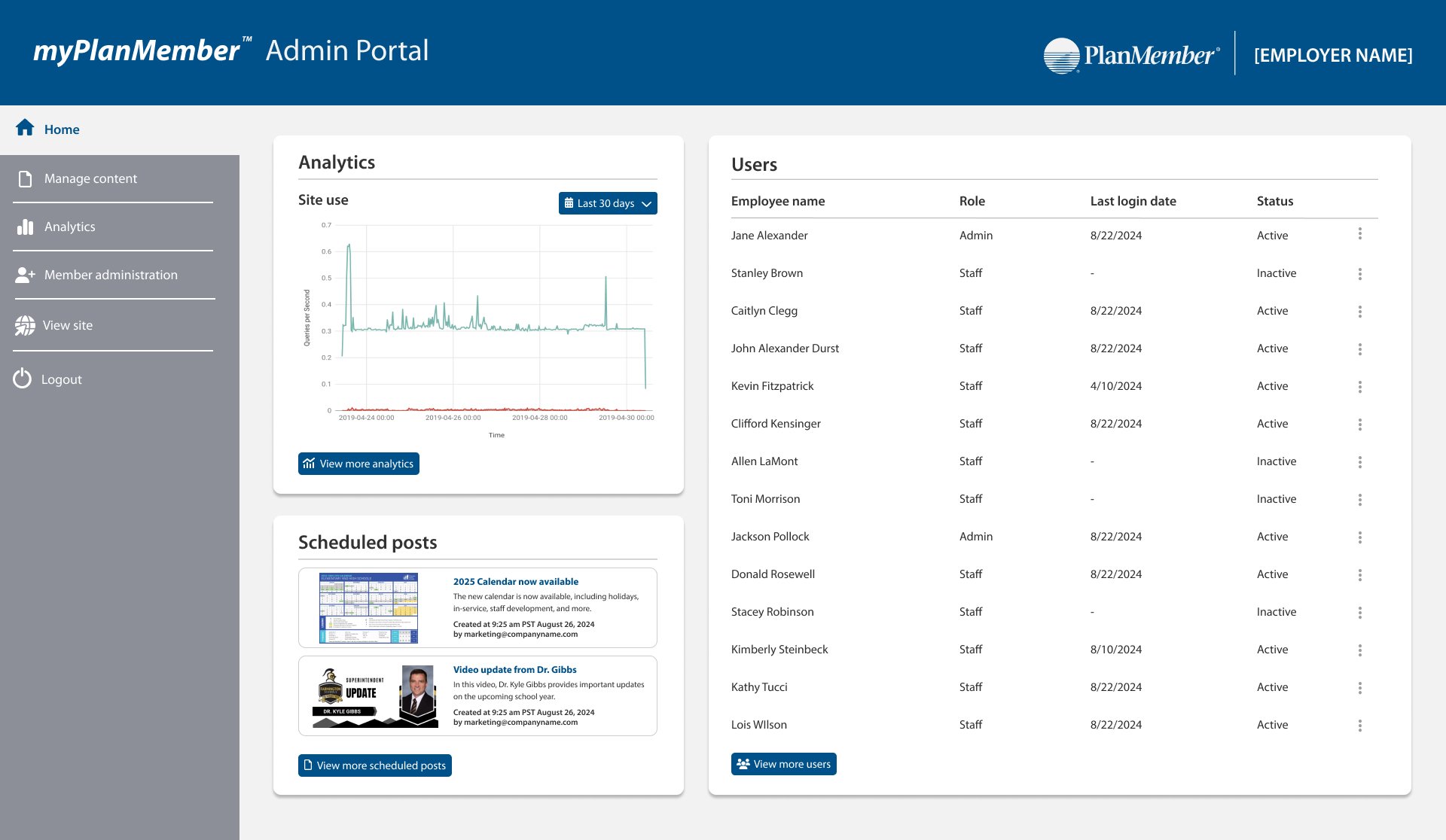
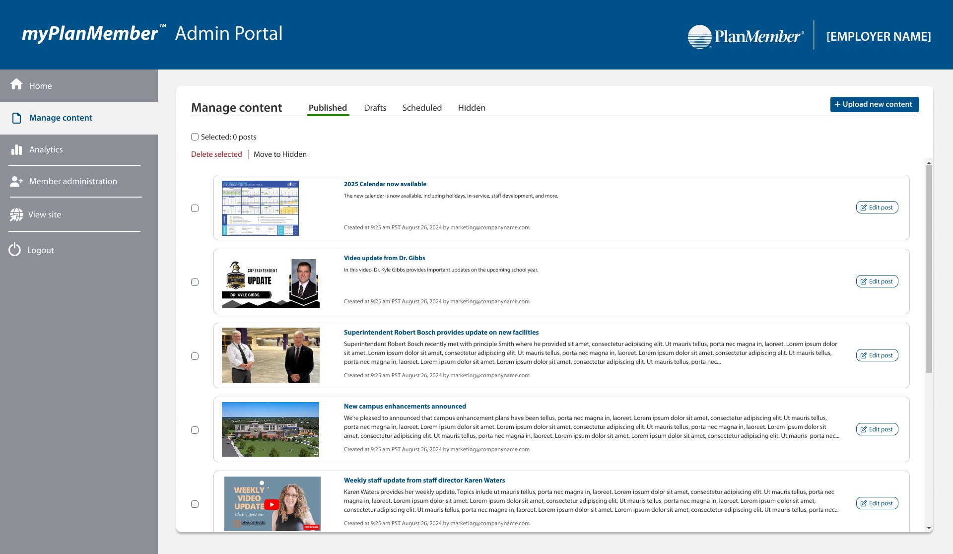
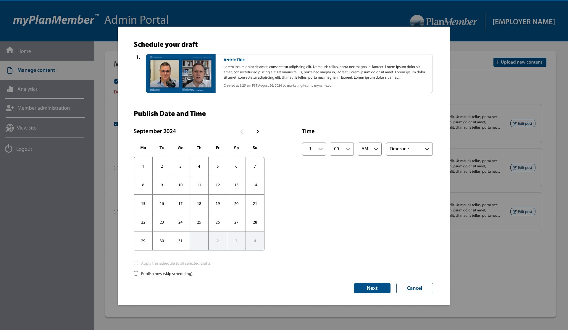
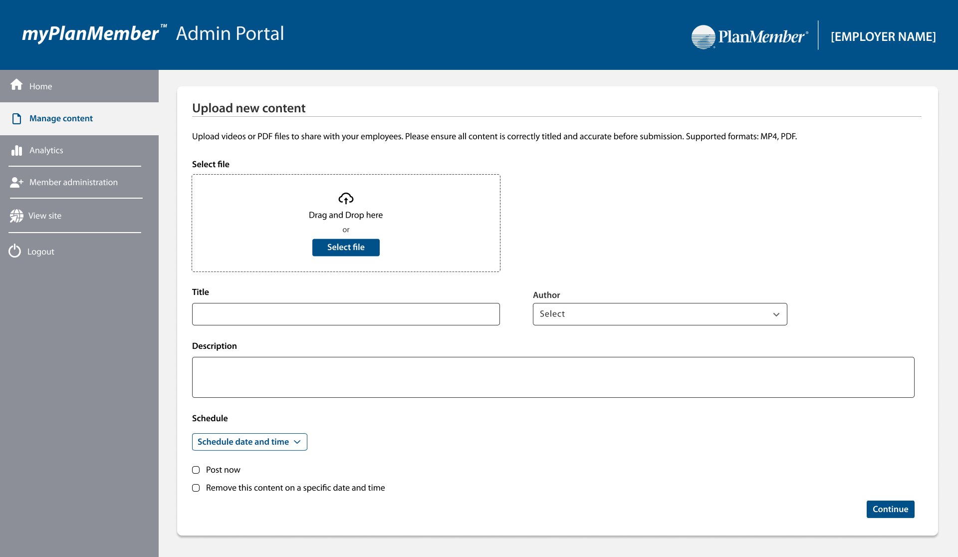
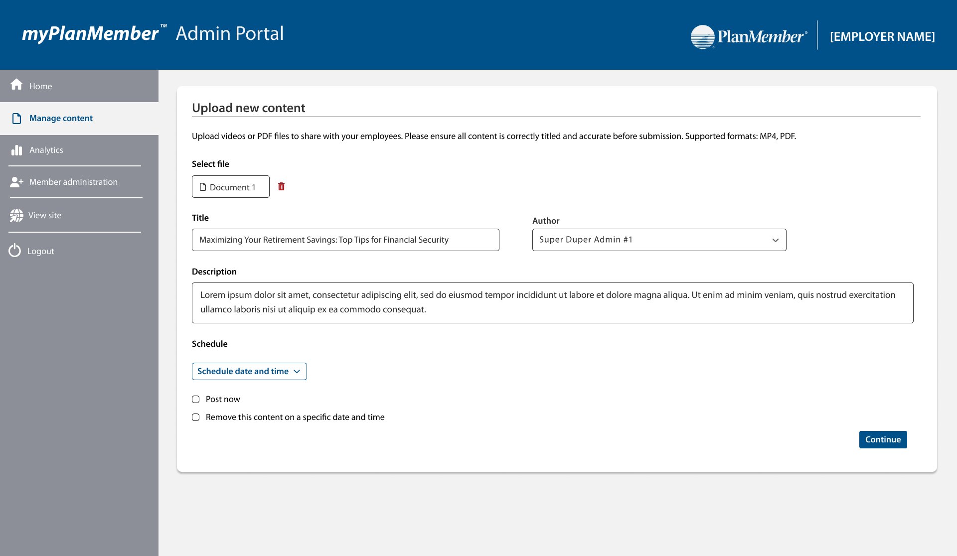
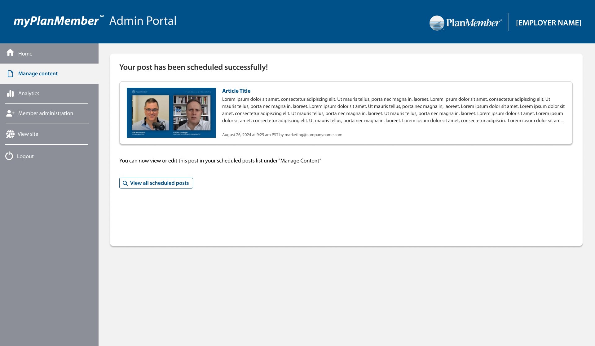
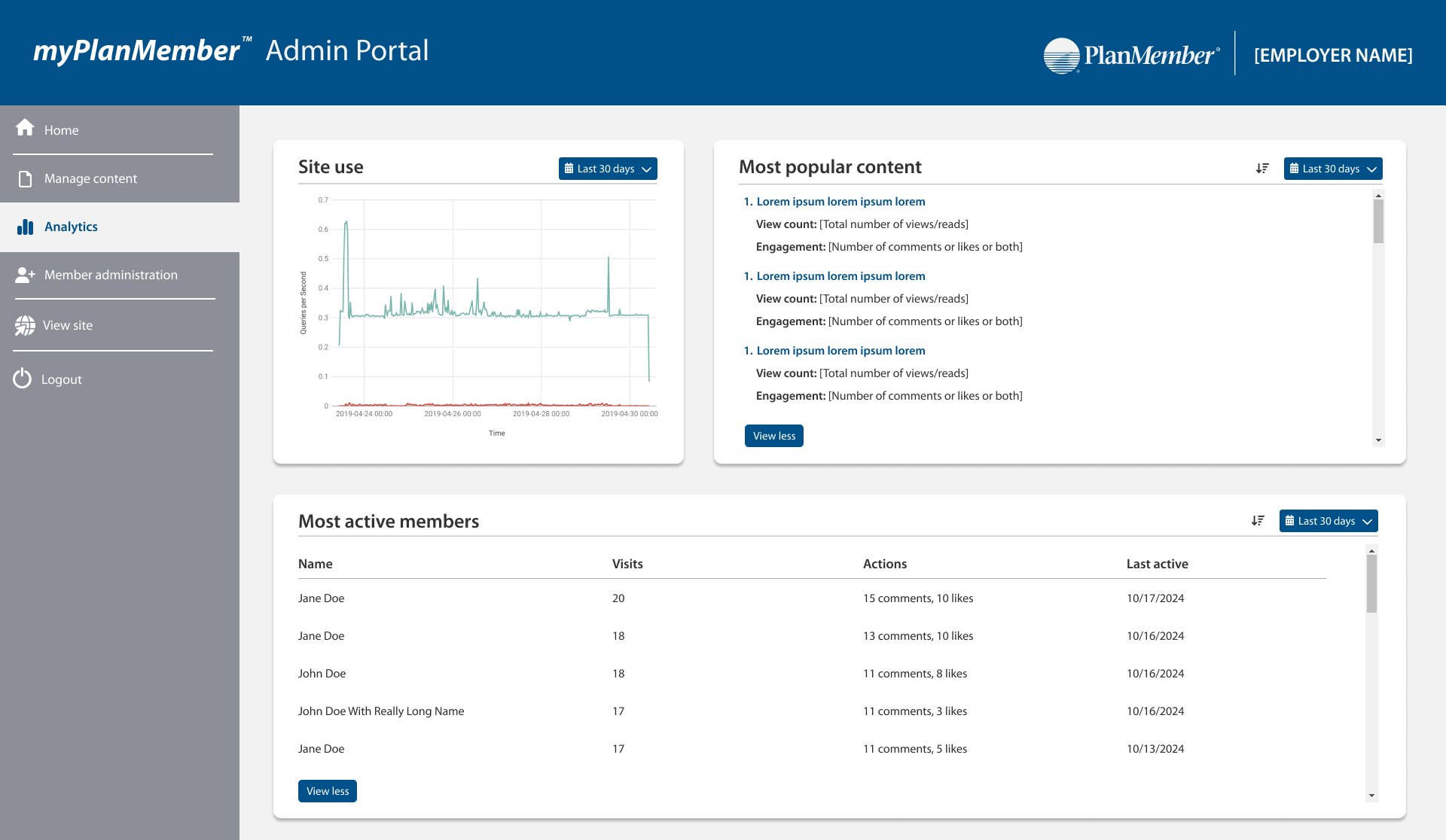
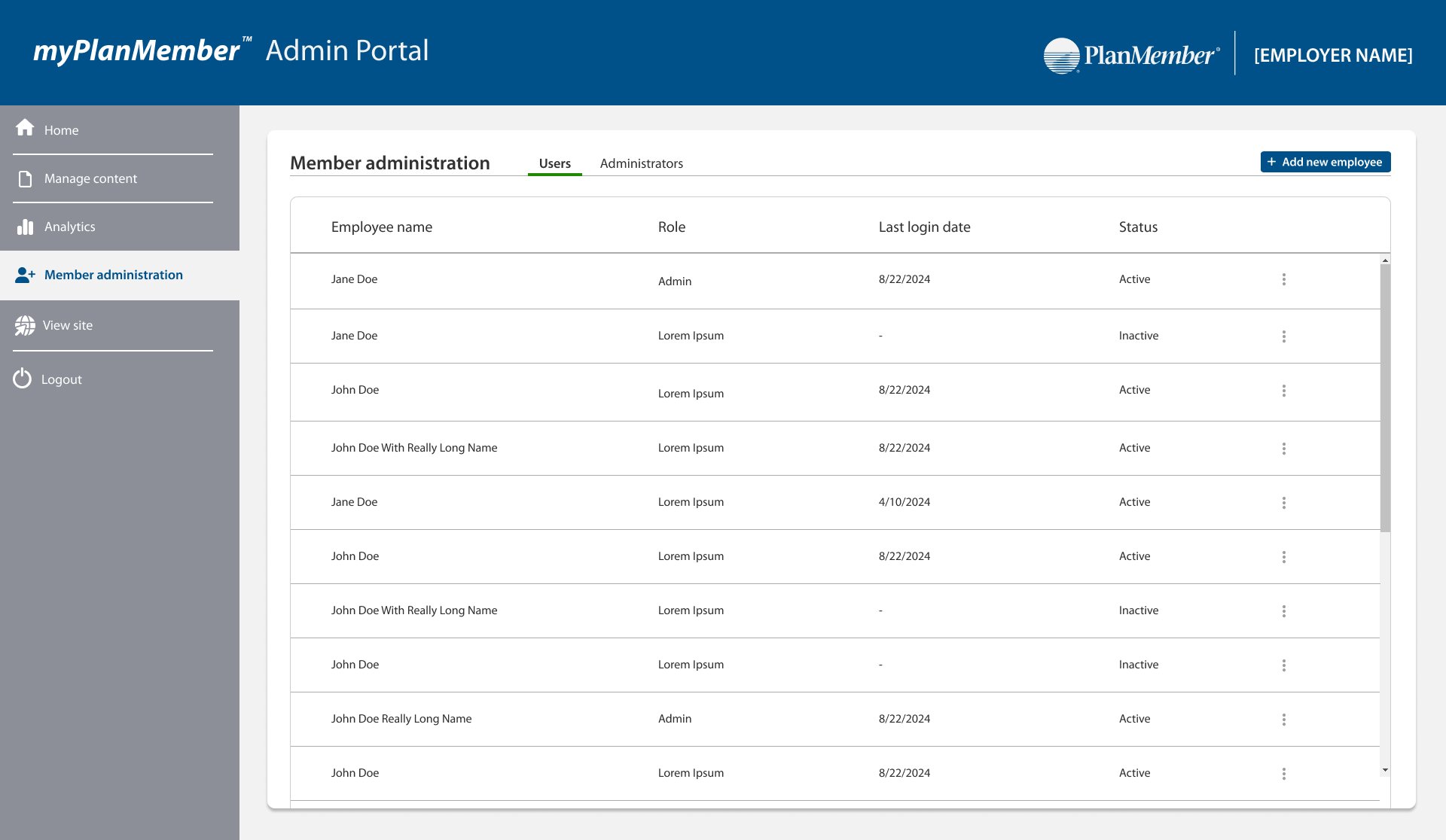
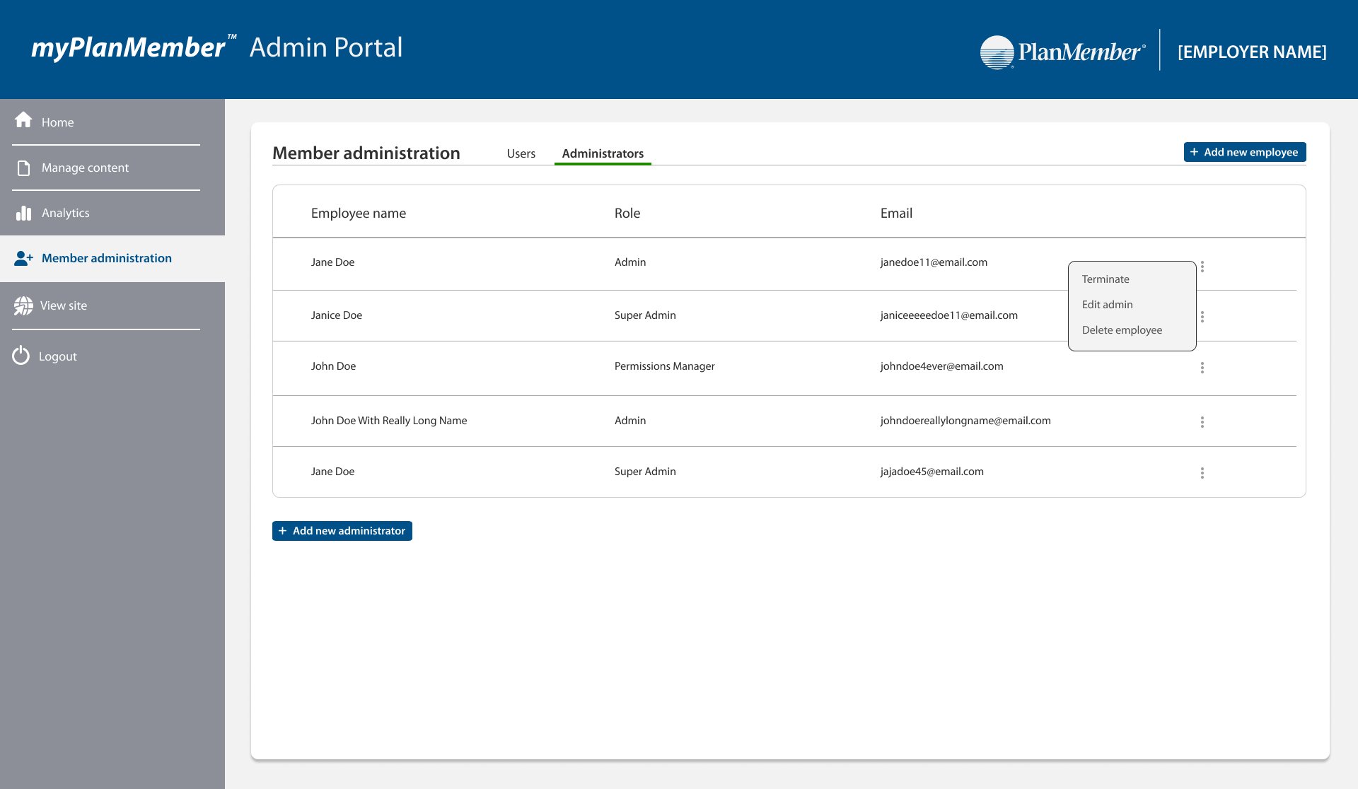
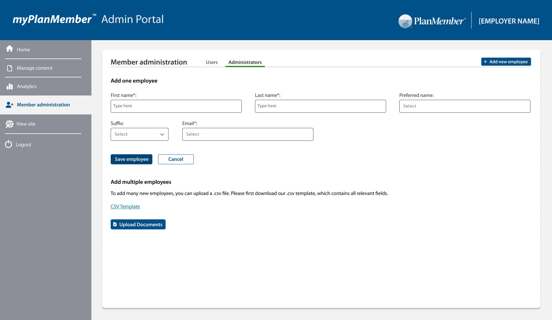
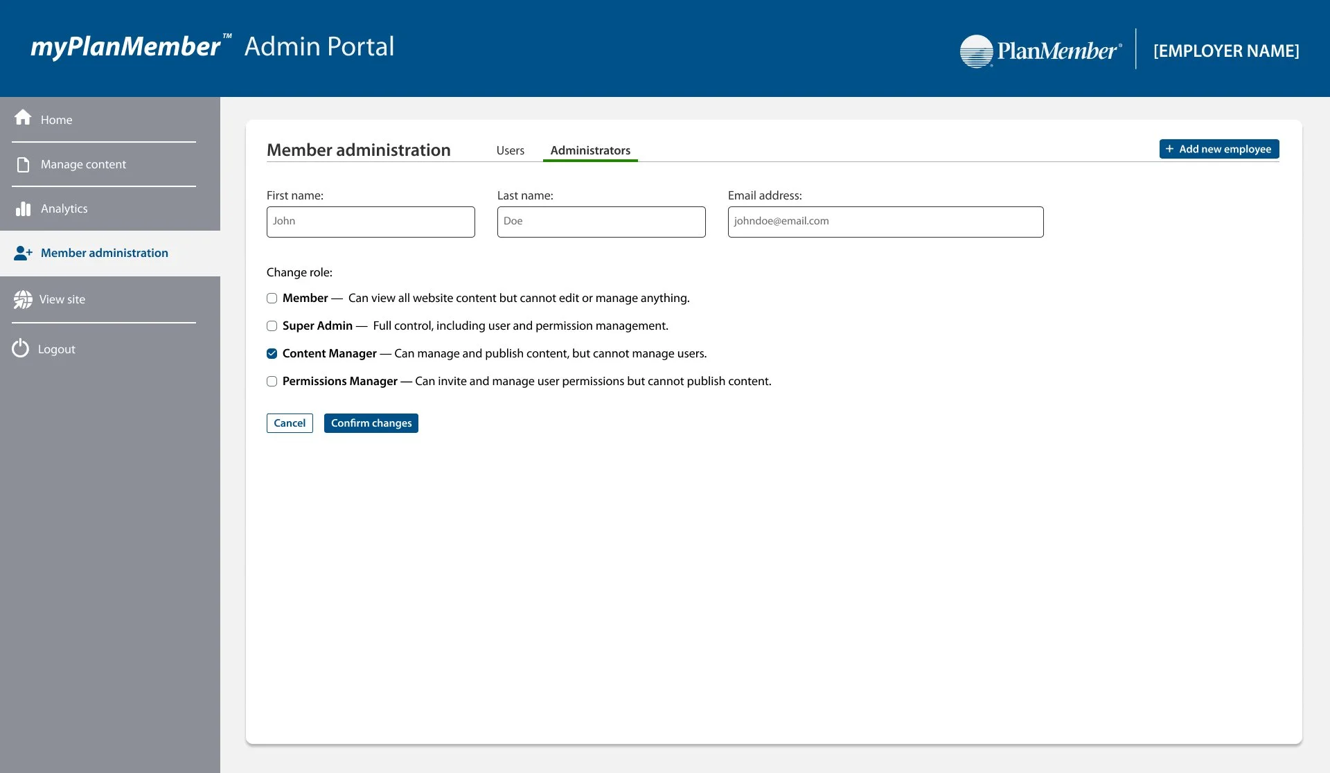
While the member-facing experience was a major focus of this project, I also led the design and strategy for the admin portal, which was built entirely from scratch. I was responsible for identifying the core needs of administrators and translating them into a powerful, intuitive tool that enables content management (including PDFs, videos, and images), scheduling, archiving, and content expiration settings, as well as employee management, permission controls, and platform analytics. To support a seamless workflow, admins also have the ability to preview the live site directly from the navigation bar, allowing them to immediately see how uploaded content appears on myPlanMember. The admin portal is fully integrated into the myPlanMember ecosystem and plays a key role in empowering organizations to customize and manage the member experience.
Progress Update
We officially launched internal testing of the myPlanMember platform on March 25th, 2025 with a group of approximately 35 employees. This marks an exciting milestone in our rollout, as we’re now actively gathering real user feedback to identify opportunities for improvement and iterate on the current designs. As part of this phase, I’ve also been conducting hands-on testing—navigating the site as a user to assess functionality, visual consistency, and overall usability.
To build on this early feedback, our next goal is to identify and meet with a small group of users to conduct deeper UX conversations. These sessions will help us better understand how users interact with the platform, uncover unmet needs, and validate whether the experience aligns with expectations. The insights gained will directly inform future design decisions and prioritization.
Next month, we will begin testing the mobile app version of myPlanMember, further expanding access to content and planning tools across devices.
Looking ahead, our next major goal is to launch Phase 2, which will introduce live chat capabilities for real-time member support, as well as a powerful admin portal connected to the myPlanMember ecosystem. This admin portal—designed in parallel with the web and app experience—will enable administrators to upload custom content (including PDFs, photos, and videos), schedule and archive posts, preview content in real time, view platform analytics, manage employee accounts, and assign permissions to other admins. These upcoming enhancements are designed to make the platform even more flexible, personal, and impactful for both members and administrators alike.
✨Phase 2: Iteration & Refinement
In Phase 1, we established a foundation for the project by identifying key user insights from focus groups, setting design priorities, building a consistent visual design system, and developing the initial website and companion admin portal. We also shared early progress updates, including details about our first round of testing and our future plans to evaluate the mobile experience.
We are now in Phase 2, building on that foundation with a focus on UI updates, usability improvements, and mobile app development informed by ongoing feedback. This phase highlights the key interface changes currently being implemented across the web and admin platforms, introduces the first version of the mobile app, connects updates to user testing insights, and outlines our progress toward making the product more intuitive, consistent, and engaging.
Usability Testing Results
During usability testing, participants shared a mix of feedback ranging from UI interactions to external factors. Some comments focused on external websites we link to and punctuation/grammar issues in written content. While these areas fell outside the scope of the design team, we documented the feedback and followed up with the appropriate teams to ensure the changes were addressed. The insights directly relevant to UI design informed updates to navigation, search functionality, and content presentation, which are detailed in the following section.
Login Button Bug
During testing, all participants—including myself—encountered a critical issue where the login button failed to load the homepage page, instead getting stuck in a perpetual loading state.
This was escalated to the development team, who resolved it in a later build.
While not a design flaw, this underscores the importance of usability testing for uncovering functional blockers that directly impact the overall user experience.
Spelling & Grammar
Several spelling and punctuation issues were flagged (e.g., “thee web experance,” capitalization inconsistencies).
These issues were added to GitHub for correction.
Spelling/grammar issues in video descriptions were documented and forwarded to the content team for updates.
Orientation & Navigation
In the document viewer, a participant did not realize they could rotate the orientation of a PDF. This functionality is a standard Microsoft Office feature that has always been available, but the user did not recognize it. While no design changes can be made on our side, this highlighted an important usability insight: users may overlook standard system features unless the affordances are clear or reinforced through guidance.
We noted this as a potential opportunity to create our own custom document viewer in the future, which would allow greater control over feature discoverability and user guidance.
Retirement Academy (Out of Scope)
Participants requested updates to the Retirement Academy experience, including:
Enlarging the homepage video or scaling it to screen size.
A way to review all quiz questions or saved answers in one place.
A “congratulations” screen after finishing sessions to give users a sense of accomplishment.
Since Retirement Academy is managed by another team, this feedback was documented and shared but not addressed in this phase.
While some feedback fell outside the design team’s scope, documenting and following up with the appropriate teams ensured that issues were addressed. More importantly, the usability insights directly relevant to our work informed the refinements we made in this phase. In the next section, we highlight the UI updates implemented across the platform, demonstrating how these findings translated into tangible improvements for users.
🎨 UI Updates & Visual Enhancements
As we moved into Phase 2, our primary focus was on refining the user interface to better align with user needs and feedback. These updates emphasized usability, personalization, and efficiency across the platform.
Key Updates:
🏠 Homepage Enhancements – Refined layout and content structure for clearer navigation and stronger engagement.
👔 Employer Content – Added dedicated sections to surface employer-specific resources and communications.
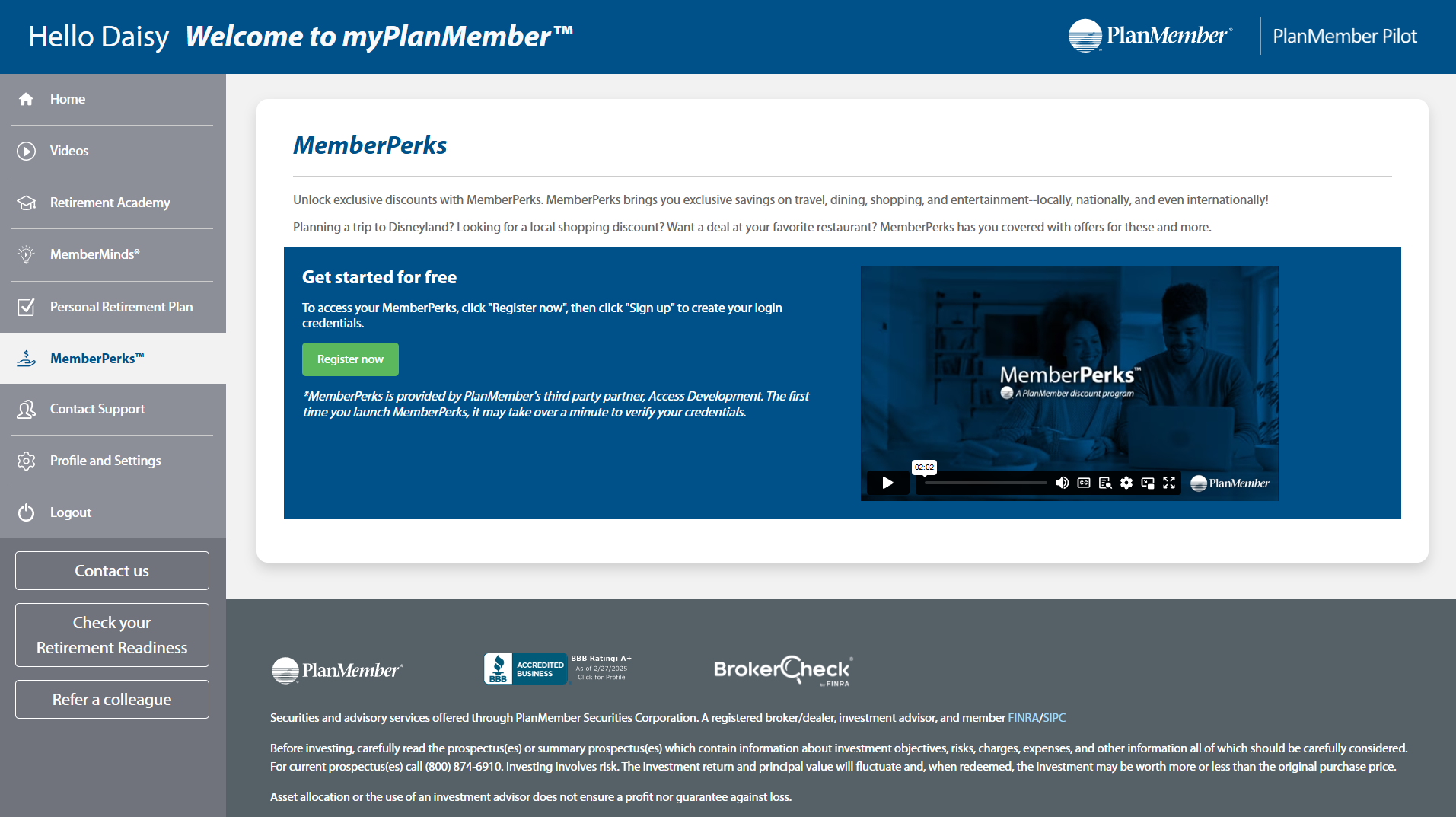
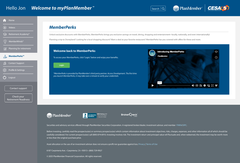
✨ MemberPerks Customization – Registered users now see personalized messaging and a distinct UI, while non-registered users are prompted with tailored calls to action.
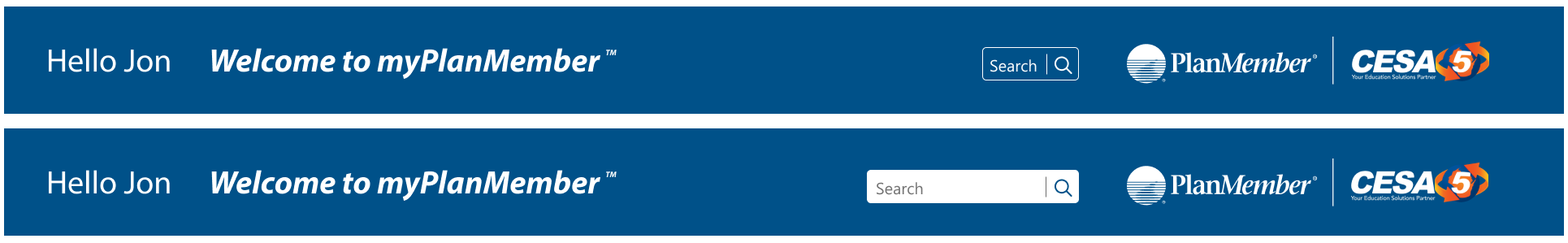
🔍 Search Improvements – Introduced a persistent search bar in the top navigation, allowing users to search across all content instead of being limited to video-only searches.

As part of Phase 2 refinements, I standardized the typography system on the homepage by refining pixel sizes across all headings (H1, H2, etc.) to improve readability and visual hierarchy.
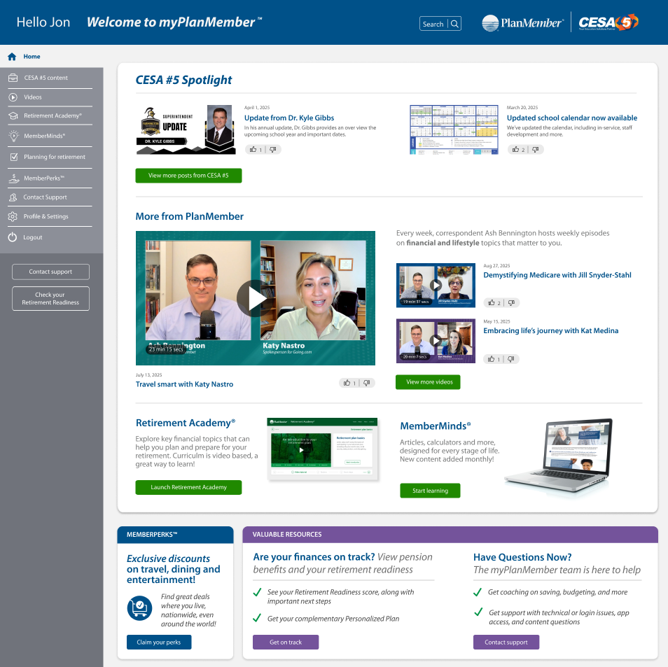
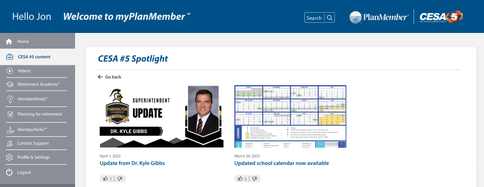
To better support organizational goals, I introduced an Employer Spotlight feature on the homepage that dynamically updates when an employer chooses to upload content.
When employer content is present, the homepage UI adjusts to surface it prominently, and the side navigation expands to include a dedicated employer content page where employees can access articles, PDFs, videos, or other uploaded resources.
The MemberPerks experience was also customized to identify whether a user is registered, presenting tailored messaging and calls to action based on their status.
In addition, I implemented a new interactive search bar in the top navigation that animates when clicked and now returns results across all content types—articles, videos, PDFs, and more—instead of being limited to video results only. Collectively, these updates enhanced personalization, discoverability, and engagement throughout the platform.
📱 Mobile App Development
To extend the myPlanMember experience beyond desktop, we developed a dedicated mobile app that brings retirement resources, employer content, and MemberPerks directly to users’ fingertips.
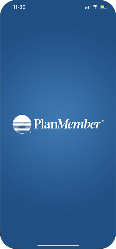
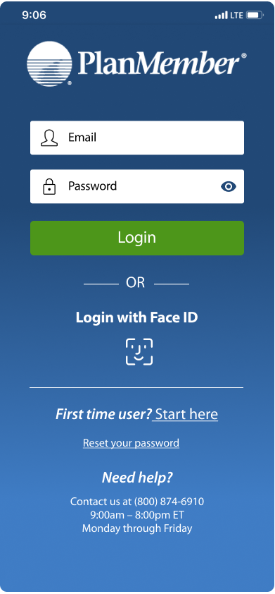
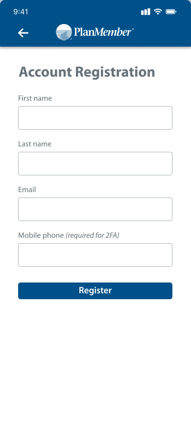
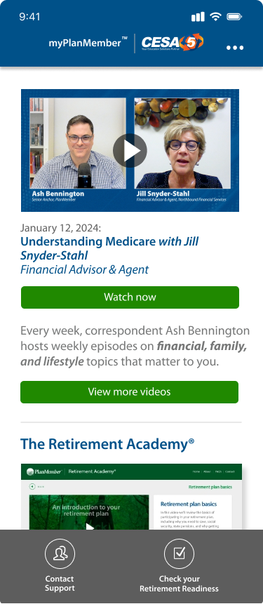
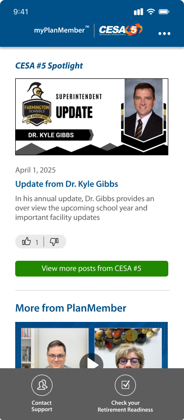
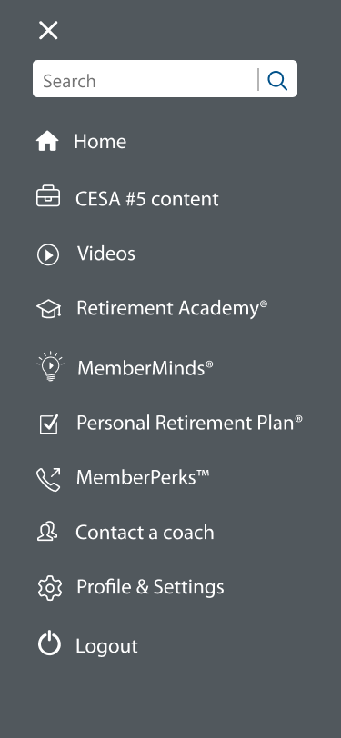
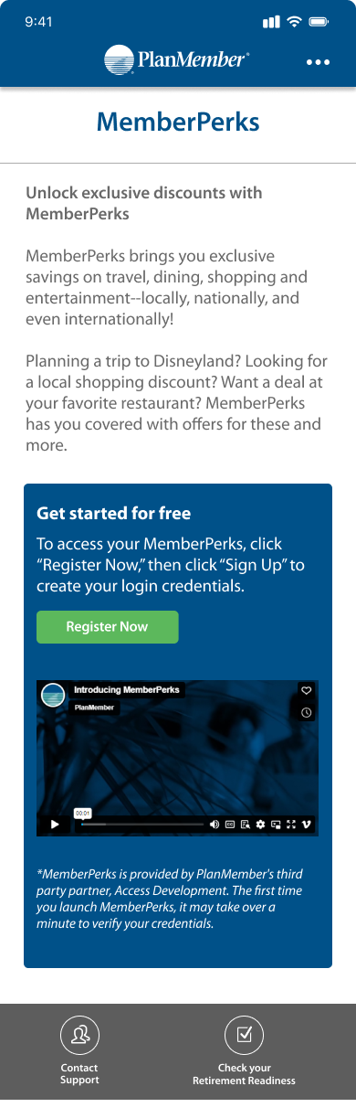
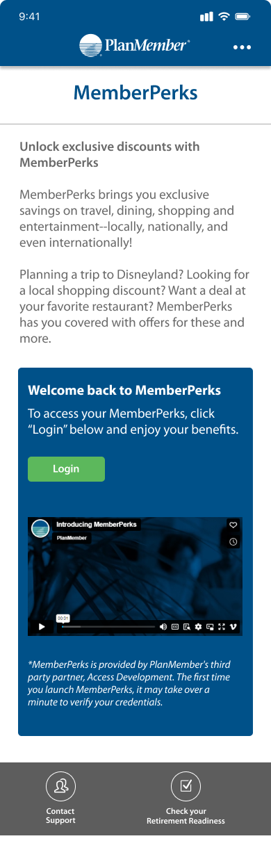
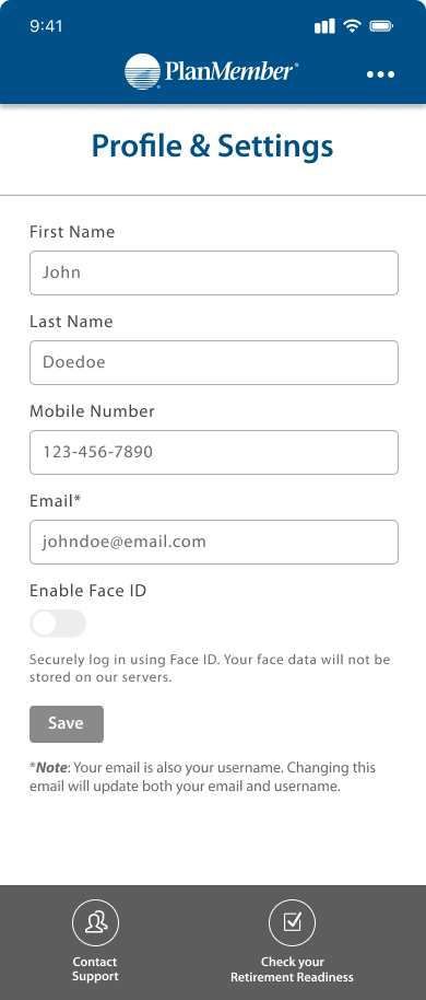

The mobile app experience begins with a branded splash screen, followed by dedicated login and registration pages that make it easy for new users to sign up and returning users to securely access their accounts. The homepage highlights featured videos, Retirement Academy content, and dynamically displays employer spotlights when organizations upload materials for their employees. From there, the side navigation menu provides quick access to employer content, videos, MemberMinds, Personal Retirement Plan, and additional tools. The MemberPerks page adapts based on user status, guiding non-registered users toward registration while presenting returning users with a login option to access their benefits. In Profile & Settings, users can update personal details and enable Face ID for secure authentication. Finally, the Contact Support page includes support hours, phone information, and a built-in message form so users can connect directly with the support team. Together, these features create a personalized, secure, and user-friendly mobile experience that complements the web platform.
Next Steps: Expansion & Admin Portal Development
Looking ahead to Phase 3, we will expand testing of both the website and mobile app to a broader group of employers and their employees, ensuring the platform continues to scale effectively across different organizational needs. This phase will also include the development of the admin portal, with early iterations and refinements taking place during its build. Once a stable version is ready, we will begin testing directly with employer administrators, while continuing to develop the mobile app internally and opening testing to external employers and employees. These combined efforts will extend our iterative design process across all user groups and solidify myPlanMember as a comprehensive, scalable solution.
Conclusion
The objective of this case study was to explore how myPlanMember delivers a holistic, user-centered experience that supports members in achieving their financial, lifestyle, and retirement goals. Through Phase 1, we established the foundation with user insights, design priorities, a visual system, and early mockups of the website and admin portal. Phase 2 focused on iteration and refinement, introducing key UI updates to the web platform and expanding the experience into a dedicated mobile app with personalized features for employers and members. Together, these efforts demonstrate how iterative design, research-driven insights, and cross-platform development are shaping myPlanMember into a scalable solution that simplifies complex planning decisions, increases engagement, and provides lasting value across every life stage.